Resolve without losing the thread.
Comments can be resolved, found again and reopened. ROUND keeps a resolved thread available as part of its version’s history.
Read the sourceProject 1 / Product design
Independent concept · 2026
A review room for freelance brand and web designers. Keep the artwork, the conversation and the decision attached to the same version.
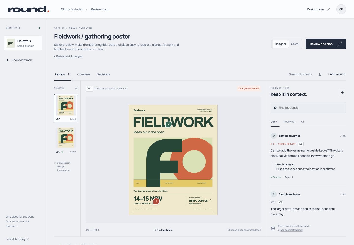
The design question
A designer needs to know what to change. A reviewer needs to know what they are looking at—and what their approval will mean.
I treated those as one connected task. The hypothesis: placing feedback beside the artwork, with a version label carried into the decision, can make a review easier to follow.
The brief grew from a design-workflow problem and desk research. The prototype is the next step toward testing that hypothesis with people.
Workflow references
Official product documentation helped define the interaction model.
Comments can be resolved, found again and reopened. ROUND keeps a resolved thread available as part of its version’s history.
Read the sourceThe separation between current and other-version comments informed a clear rule: a request on v01 should stay on v01.
Read the sourceVersion stacks and side-by-side comparison informed a review room where earlier work is easy to revisit without changing the latest version.
Two directions explored
I chose the canvas as the starting point.
Both layouts support the same task. The decision is about what a reviewer should understand first: a queue of comments, or the design those comments refer to.
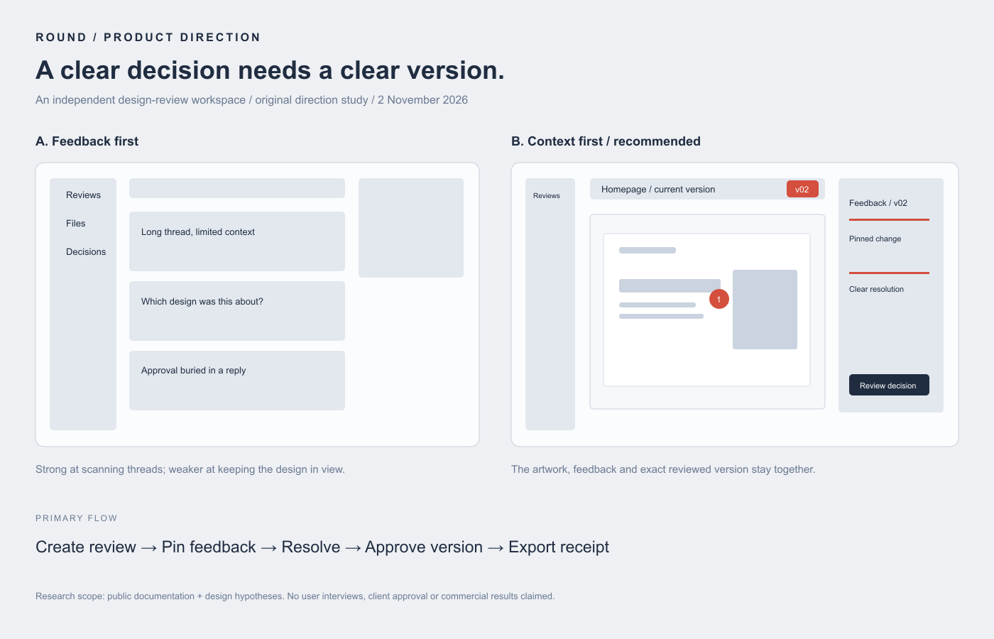
A / feedback first
Long threads are easy to scan. The trade-off is repeatedly reconstructing which part of the design a comment refers to.
B / context first · selected
The artwork takes the centre. Feedback sits alongside it, and the current version remains visible as the reviewer moves toward a decision.
The defining interaction
A completed comment and an approved design are different things. ROUND makes that distinction part of the structure.
The image and its version are the reference point for every thread.
Give the date more breathing room.
Open requestPinned or general feedback keeps the same version label. Replies and resolution stay explicit.
After blocking feedback is resolved, the reviewer confirms the exact version.
A revision starts a new review. The v02 decision stays in its history.
Decisions & trade-offs
Requests and questions must be resolved before approval. Informational notes can remain open. That adds an explicit decision step, but makes the meaning of “done” clearer.
Earlier versions remain available for inspection and comparison. New feedback and approval act on the latest version, with clear labels when viewing an earlier round.
The feedback list gives each pin a readable counterpart. General feedback provides another route when a comment applies to the whole design.
Browser-local storage keeps this prototype focused on reviewing, revising and deciding. A downloadable packet carries the artwork, feedback and version context together.
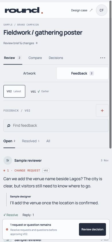
A review away from the desk
The version, the work and the next action need to stay connected on a phone.
The first mobile layout stacked the controls, artwork and comments. Feedback was too far down the page. The revised layout switches between Artwork and Feedback in one tap, keeps the version visible and anchors the decision at the bottom. The full brief stays available in a disclosure.
Explore the responsive prototypeRefining the first round
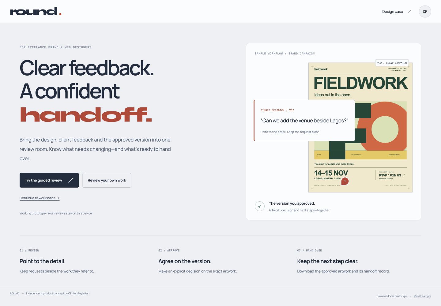
The first build opened directly into a populated workspace. It showed the system before explaining why to use it.
I narrowed the audience to freelance brand and web designers, added a choice between a guided review and the designer’s own work, and made the next step explicit in the sample journey.
Approval now includes what happens next. The downloaded handoff packet carries the exact artwork, reviewer, decision time, feedback and agreed next steps. A new revision starts a new review; its predecessor keeps its own handoff record.
Prototype checks
The working prototype was checked at the moments where context could be lost.
These are functional checks of the prototype, rather than a usability study. Evaluation with independent designers and client reviewers is the next research step.
See the decisions in use
Brief, direction study, state model and editable project source.