INDEPENDENT BRAND & COMMERCE CONCEPT / 2026
A brand you can
put in your basket.
A Nigerian pantry concept, built from the label out. One identity carries across three jars, a campaign and a working shopping experience.
- The brief
- Make unfamiliar pantry choices feel understandable and useful.
- My work
- Positioning, identity, packaging, art direction, ecommerce UX & frontend.
- The result
- An editable brand system and a shop you can try, with a three-jar box builder.
THE IDENTITY DECISION
Make the name
feel generous.
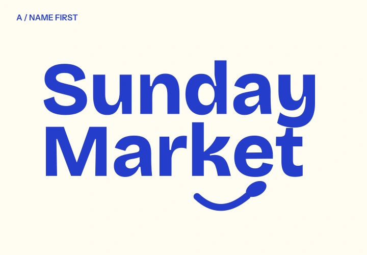
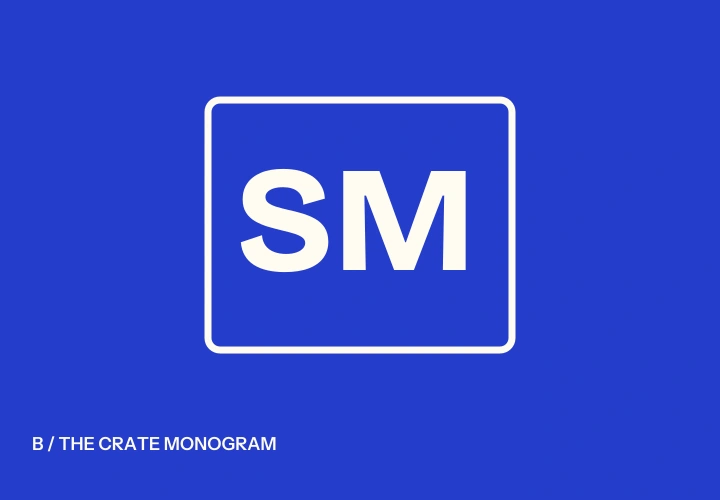
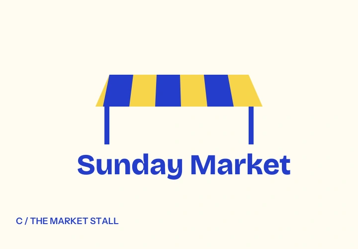
A wordmark, a crate monogram and an awning symbol were explored. The stacked wordmark won because the name stays prominent at jar size; the spoon underline gives it a small, recognisable gesture.
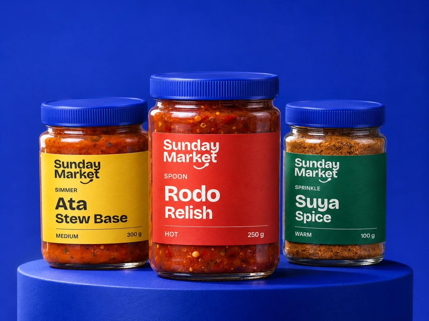
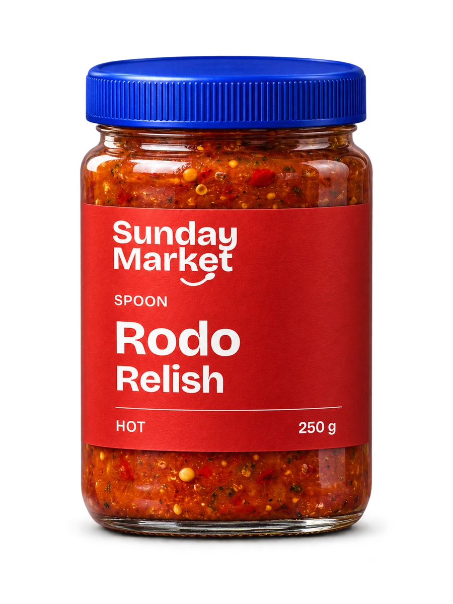
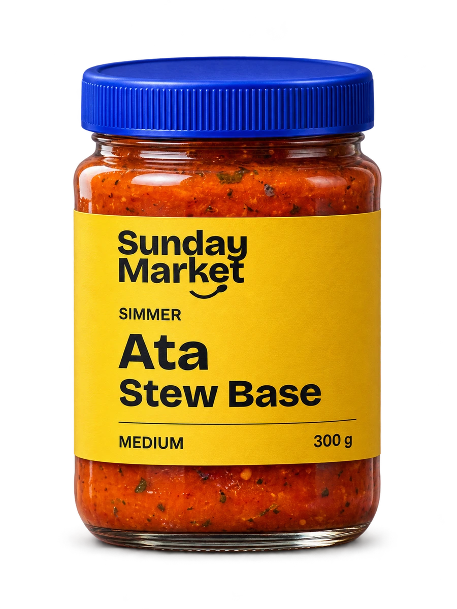
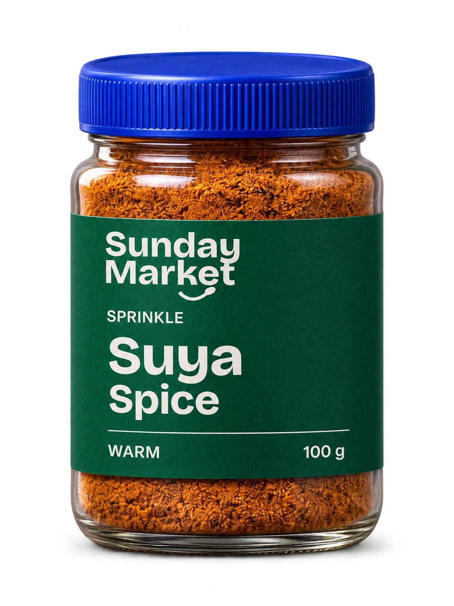
Cobalt carries the brand. Tomato, corn-yellow and pepper-green separate the range. Heat and cooking words repeat the distinction, so colour does not have to work alone.
FROM THE SHELF TO THE SCREEN
Spoon. Simmer.
Sprinkle.
Each label gives the product a name and a cooking verb. The same words become serving ideas in the shop, linking visual identity to a practical choice.
AN INGREDIENT LANGUAGE
Draw from
the pantry.
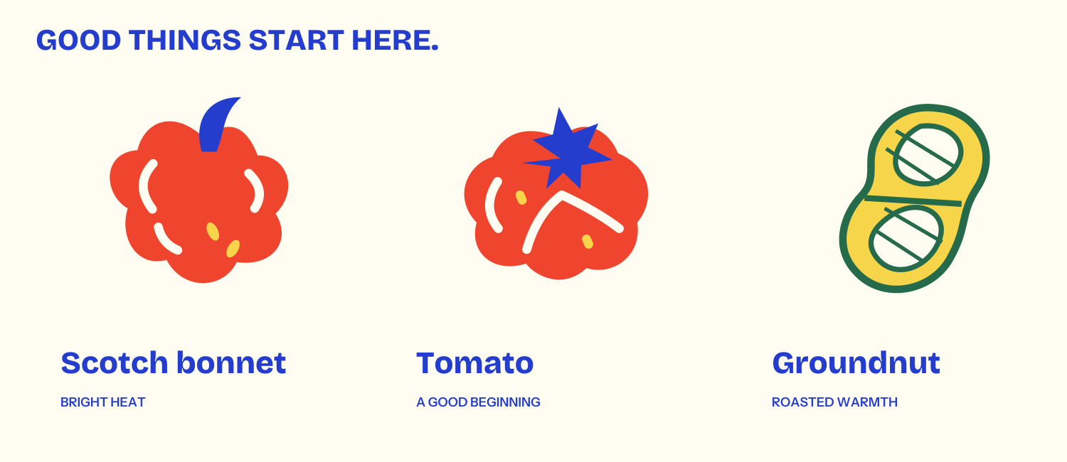
Scotch bonnet, tomato and groundnut give the brand its own graphic vocabulary. These original illustrations repeat in the product information, serving panels, carton and campaign.
The product photography now follows the hero’s glass, lighting and label treatment. The illustrations carry the personality around the products.
BEYOND THE FRONT LABEL
All the way
around the jar.
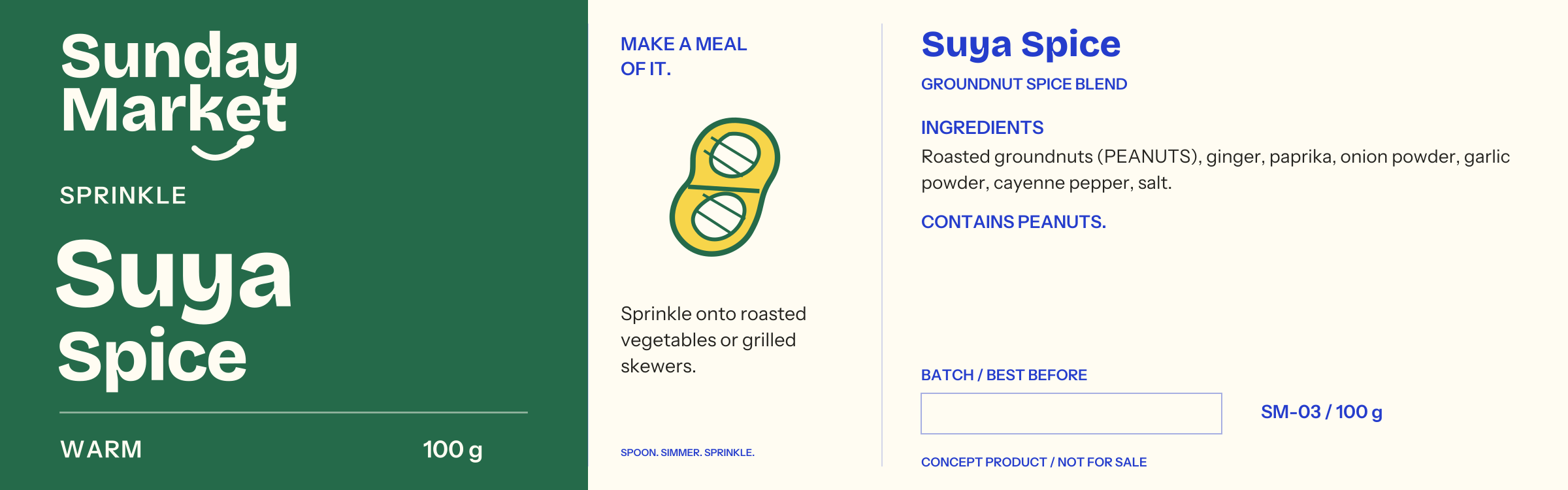
Each full wrap connects the front name to a serving panel and a reverse with ingredients, allergen information and a date-coding area. The hierarchy stays consistent across all three products.
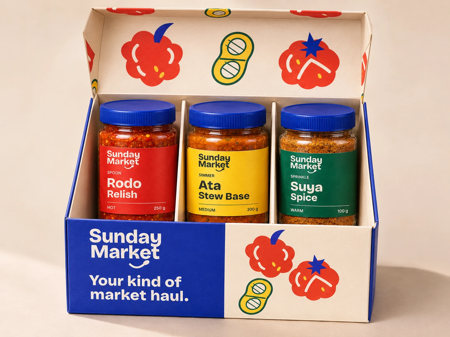
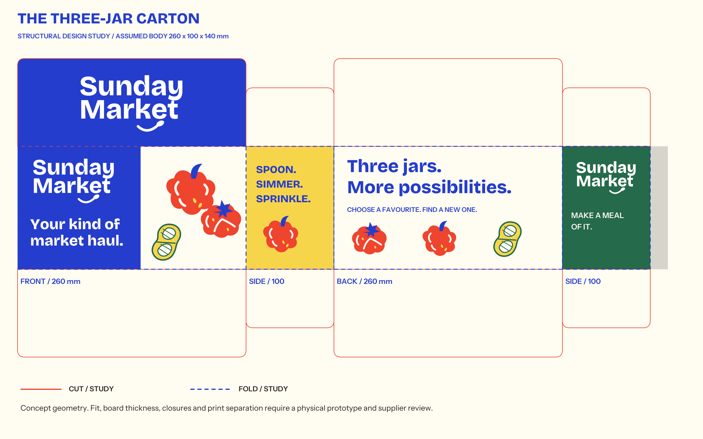
The outer carton carries the wordmark outside and the ingredient pattern inside. Its flat study includes connected front, side and back panels with cut and fold guides.
Inspect the carton structure
 Open the editable structure study ↗
This is a design study. A physical fold test and supplier review are still needed to confirm jar fit, board thickness, closures and print setup.
THE SHOPPING DECISION
See the choice.
Know the total.
Heat filters narrow the small range. Product details keep ingredients, allergens and serving ideas close to the purchase action.
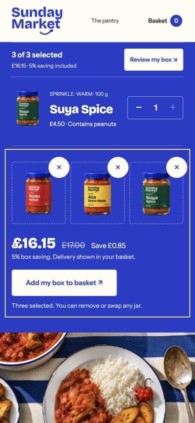
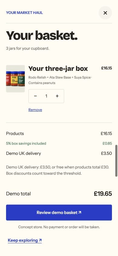
The three-jar builder keeps a selection count in view and a quantity beside each product. Repeats can be added or removed one at a time, with the exact 5% saving shown when the box is complete. The basket recalculates quantity, discount and delivery together, with the total beside the review action.
The final step is explicitly a demo summary. Nothing is purchased and no payment details are requested.
A SYSTEM BEYOND THE HOMEPAGE
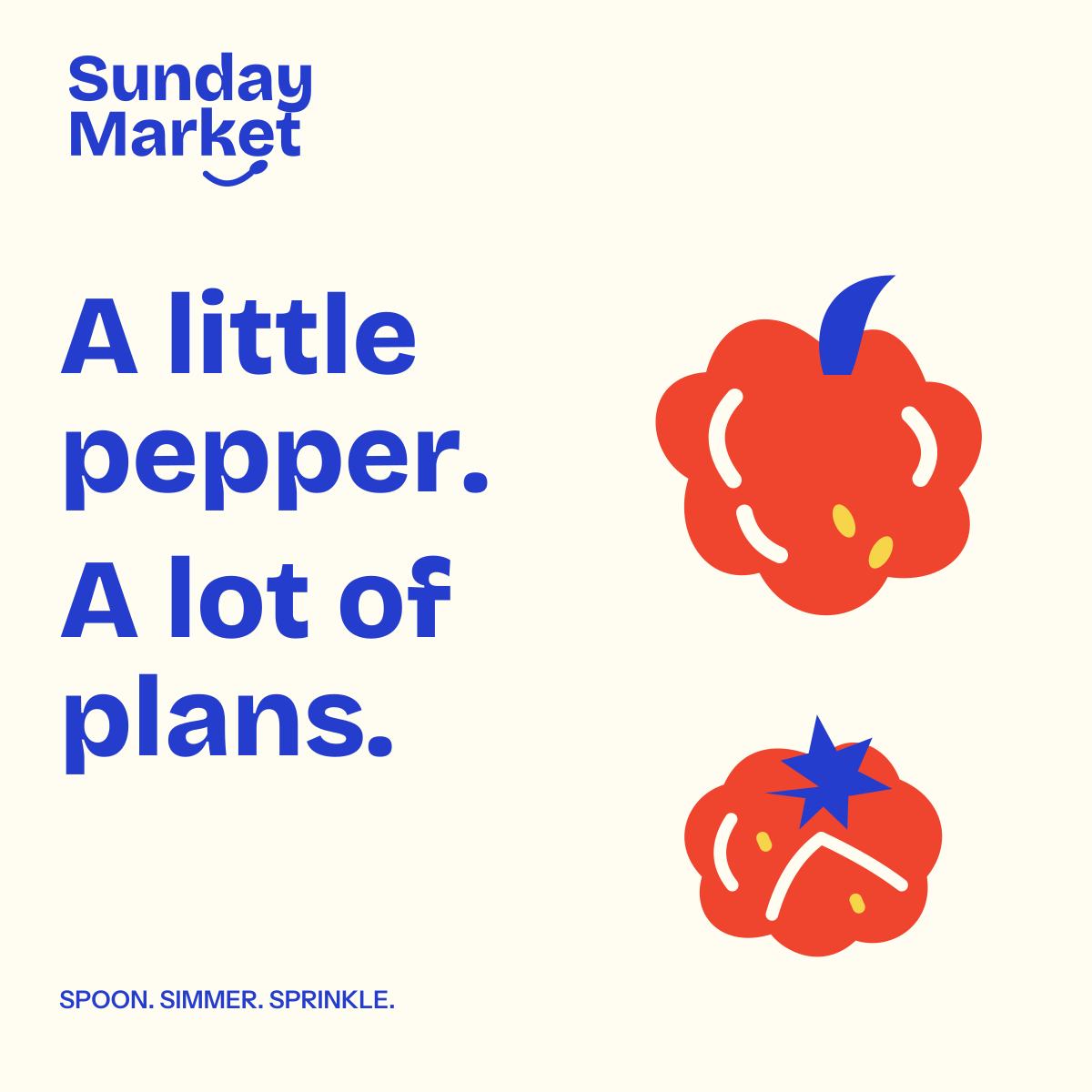
A little pepper.
A lot of plans.
The ingredient illustrations, lettering, spoon motif and product colours carry into campaign artwork and the carton liner. The handoff includes outlined identity files, front and reverse label studies, colour values, licensed fonts and usage guidance.
Open the brand guidelines ↗WHAT THIS DEMONSTRATES
One idea.
Multiple touchpoints.
Positioning, identity, packaging, campaign art and ecommerce interaction form one system. Fifteen automated tests cover the basket rules, including all 27 possible three-jar combinations. The browser journey covers visible selection feedback, repeats, removal, reviewing the box, changing the basket and exporting a concept summary.
The next research question is whether cooks can choose a useful first box without help. No customer study or commercial results are claimed.
Project context & references
Independent concept by Clinton Feyisitan, developed with AI assistance. Products, prices and recipes are fictional. Physical pack and food images were generated from the project art direction; editable identity and label artwork are original SVG files.
Desk references: Pentagram’s Yolélé identity case and Yolélé’s product explanations. Their identity and artwork are not used here.